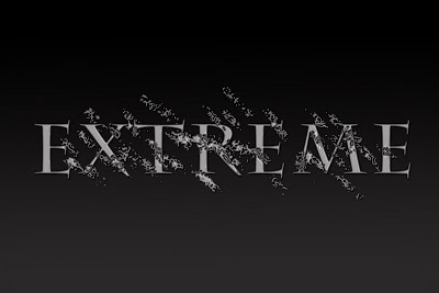
I've never really gotten into any type of editing and designing that isn't directly related to photography. I've never really messed with any kind of graphic design. Today, I played around with making text for a two day project.
The project is going to have an exercise theme, so, of course, I went with a word that describes my favorite workout program: Extreme.
For the background, I had a plain black that I shaded to grey using a regular gradient. I then added a motion blur to create some lines in it. I played around with fonts for awhile, trying to find one that really fit my concept. I wasn't super happy with what I got. My font selection is pretty pathetic. I did go online and find some pretty sweet ones for future use though. On a new layer, I added random spots with a regular brush. From those spots, I added texture by using a textured image and a distortion map. It's hard to explain how this really worked, but it pretty much took the textured image and streaked it through the spots I made.

The last thing I did was add some style layers to the texture and the word. It created a 3d look on the texture, making it jump out more. With the text, I simply added a stroke a bevel around it to give the word some depth.
It's nothing amazing, but hopefully, it will look pretty sweet with the photo I have planned for tomorrow.
No comments:
Post a Comment