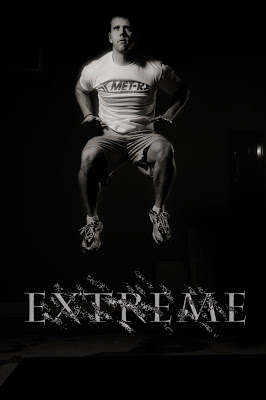
I'm not very satisfied with today's product. My plans were to mix the text that I created with the photo from yesterday. I accomplished this, but I don't think it is anything special. Maybe in the future I will come back and redo it.
First, I decided to mess around with the photo. I changed it to black and white to create a more dramatic look and because I felt the text was better with a black and white photo.
I wasn't sure exactly where to place the text. I moved it around quite a bit until I decided to go with the edge of the mat. I wanted to put it in the air, but there was no space above my head. I thought it looked fine on the bottom, but I didn't want it to block the floor and how high I was jumping. I think it's ok where it is.
My biggest problem is how the two interact with each other. They don't really do anything; they don't blend or do anything fun. All I did was a layer mask to blend part of the text out. I'm thinking in the future I might rotate the word and make it more 3D.
Tomorrow I'm thinking about messing with a different program. There's some video editing software I've never played with. It could be pretty cool.
No comments:
Post a Comment